Exploring Bias using NIST's FRVT
“All unbiased algorithms are alike; each biased algorithm is biased in its own way.” In this post we will see how valid Tolstoy’s quote is when applied to face recognition. There is no doubt that face recognition algorithms are biased: their accuracy is different for different population groups. In fact, it is hard to check the first part of Tolstoy’s quote, because we don’t know any unbiased algorithms. But we can investigate the second part. How does bias differ across algorithms?
How will we do this? As part of NIST’s Face Recognition Vendor Test (FRVT) algorithms are evaluated not only for overall accuracy but also racial, gender, age and geographic bias. Here, we will focus on geographic bias1.
By parsing NIST’s algorithm report cards, we can obtain data for ten geographic regions (Sub-Saharan Africa, South Asia, Polynesia, North Africa, Middle East, Europe, East Asia, Central and South America, Central Asia, and East Asia). In particular let us look at the cross-region false match rates (FMR) at a fixed overall threshold. What this means is that for each algorithm we determine a decision threshold that would give an overall FMR=1e-4. With this threshold we then measure the FMR obtained when verifying images from region A against enrolled images from region B and plot the log10 FMR values in a heatmap, such as the one below.
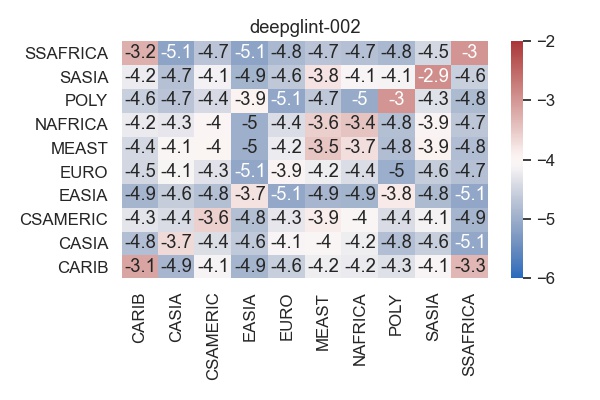
A perfectly unbiased algorithm would have a uniformly grey heatmap with -4 = log10(1e-4) in each cell. Unfortunately, algorithms are not perfectly unbiased and so we see that, e.g., matching images from the Caribean (CARIB) against images from Sub-Saharan Africa (SSAFRICA) gives an FMR=1e-3.3=0.0005, which is 5 times higher than the overall FMR of 1e-4=0.0001.
Distribution of bias
We can look at the FMR heatmap of each individual algorithm, but there are over 200 of them, making it difficult to spot trends. First, we will restrict our analysis to algorithms that meet a basic threshold for accuracy. We require that the false non-match rate (FNMR) satisfies FNMR<0.1 at FMR=1e-6 on the visa image dataset. Of all algorithms 197 meet this criterium. We do this, because overall performance and bias are not independent. If the FNMR is too high then the algorithm is not useful and so any questions of bias become irrelevant.
There is no unique way to summarise bias in a single number, which is why NIST published the full heatmaps. But it is insightful to try regardless. We look only at the diagonal of the FMR matrix, i.e., we look at the within-region FMR values, and we consider the following three measurements. The first measures the average distance to the mean, the second measures the maximum distance to the mean and the third measures the range of numbers along the diagonal.
\[\begin{aligned} \mathrm{Bias}_{L^1} &= \frac{1}{n}\sum_{j=1}^n \left| \mathrm{FMR}(j,j) - \overline{\mathrm{FMR}} \right| \\ \mathrm{Bias}_{L^\infty} &= \max_{j=1,\dots,n} \left| \mathrm{FMR}(j,j) - \overline{\mathrm{FMR}} \right| \\ \mathrm{Bias}_{\mathrm{Range}} &= \max_{j=1,\dots,n} \mathrm{FMR}(j,j) - \min_{j=1,\dots} \mathrm{FMR}(j,j) \end{aligned}\]Here, \(\overline{\mathrm{FMR}} = \frac{1}{n} \sum_{j=1}^n \mathrm{FMR}(j,j)\) is the average FMR along the diagonal. As we can see below the three bias measures are highly correlated and yield almost the same results.
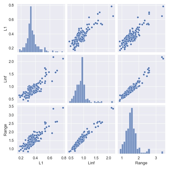
If we sort all algorithms by their bias, how do most and least biased algorithms look like? The least biased algorithm according to the \(L^1\)-measure is shu-002,
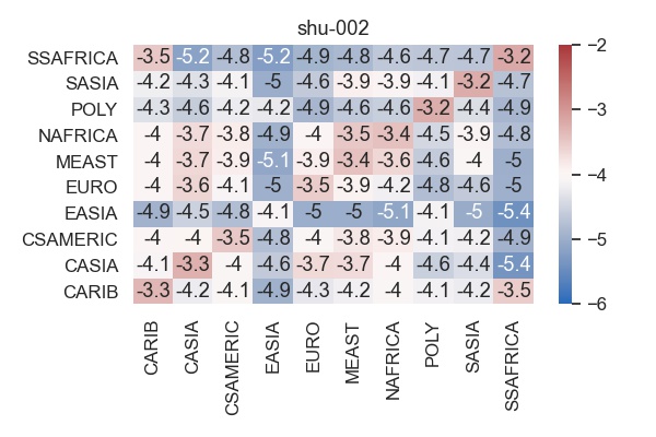
while the most biased one is fiberhome-nanjing-002.
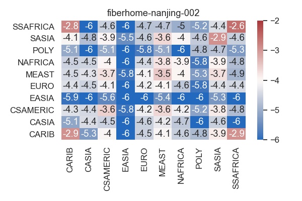
The bias for fiberhome-nanjing-002 results from the fact that the algorithm has a very low FMR for East Asia at the expense of significantly higher FMR for other regions. Is this a problem? That depends on where the algorithm will be used. It is easy to imagine applications with a mostly East Asian user base, but much more difficult to find applications where the user base is exclusively East Asian.
Dimensionality reduction
We want to investigate the following question: How much variation is there across algorithms? Can we find common properties across algorithms? For example, in a previous post we saw that all algorithms had higher FMR on white males compared to black females. Here our data are the 10x10 heatmaps, and so the the number of possibilities is much larger. To gain some insight, we will the UMAP library to perform nonlinar dimensionality reduction and visualise the space of heatmaps in 2D.
To make spotting trends easier, the tooltips in the plot below don’t show the heatmaps themselves, but rather how much each heatmap differs from the mean heatmap (averaged in log10 space). The mean heatmap is shown here.
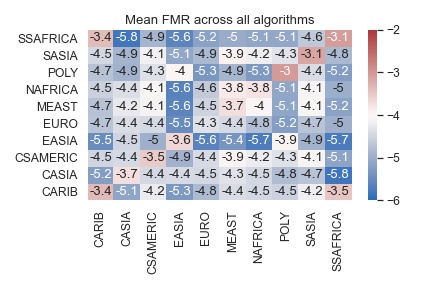
This is not in any way a bias-free algorithm, rather it shows the mean of the existing algorithms. We notice that FMR for Polynesia, South Asia and Sub-Saharan Africa are higher that for other regions, while East Asia is well separated from other regions, evidenced by a low cross-region FMR. The UMAP plot will show how these trends are either amplified or dampened by various algorithms.
What do we see?
- The algorithms on the left, in particular those in the cluster around (0, 7), have lower FMR for East Asia and Polynesia and higher FMR for all other regions.</li>
- Conversely, the algorithms on the right have lower FMR for the Carribean and Sub-Saharan Africa.</li>
- The data seems to fall into two distinct clusters, but it is not clear if there is a simple criterium separating them. One hypothesis is that the FMR for Europe is higher than average on the left and lower than average on the right.
PCA
We can also stay in the linear world and apply PCA to the set of FMR heatmaps. First, let us look at the principal components. As they are directions of variation in the space of heatmaps, they need to be added to the mean heatmap shown above.
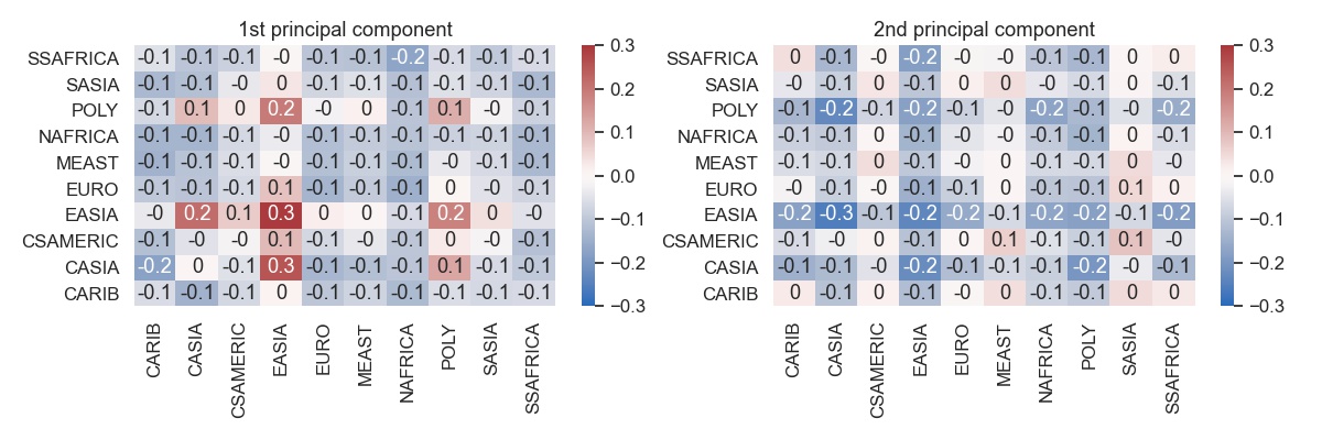
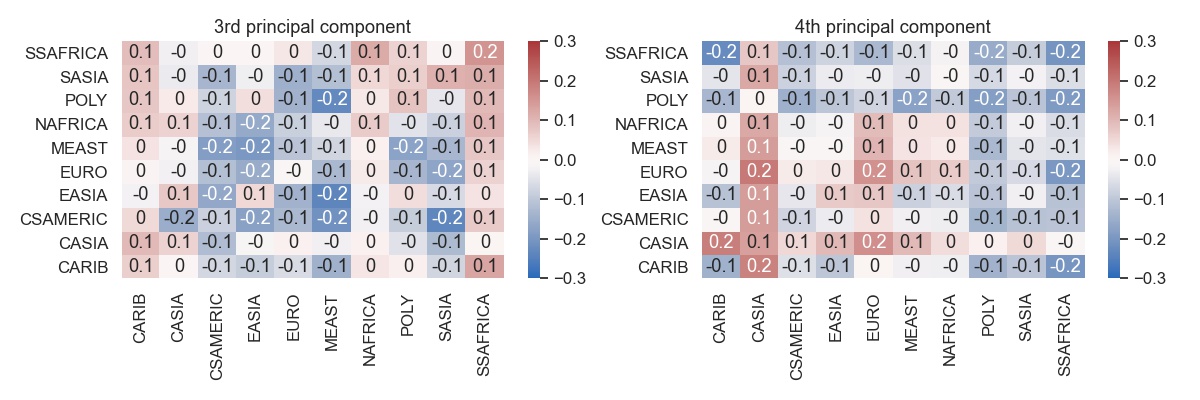
Some distinct patterns emerge.
- The first principal component is focused on EASIA and to a lesser extent POLY and CASIA. What is interesting that along this direction the within-CASIA FMR does not change, but the across-region FMR between CASIA and both EASIA and POLY does change.
- The effect of second component is spread more broadly. It changes the FMR for all regions except for CSAMERICA and MEAST and SASIA.
- The third component shows a tradeoff between FMR for CARIB and SSAFRICA on one side and Asia on the other side.
- The fourth component similarly shows a tradeoff between CASIA and EURO on one side and POLY, SASIA and SSAFRICA on the other side.
What these principal direction seem to tell us is that developing an algorithm involves performance tradeoffs. Reducing FMR on one region leads to increased FMR in other regions. Of course an empirical study such as this does not prove in any way that the tradeoffs are inherent or inevitable, only that they are prevalent in the existing algorithm population. For some algorithms these tradeoffs are made consciously by the developers through dataset selection, sampling strategies, etc. In other cases they happen implicitly without anyone choosing which region to focus on. But there is no principal direction that reduces the FMR across the board, not even along the diagonal.
How much variability?
Principal components show trends among algorithms. We can also use PCA to investigate how much variation there is among all 197 algorithms.
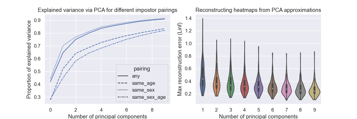
The graph on the left shows the proportion of variance explained by the first principal components. While all other graphs in this post deal with any (or zero-effort) impostor pairing, here we also compare with same sex, same age, and same sex and age impostor pairings. What we see is that same age impostor pairings (with or without also using same sex) leads to larger variability across algorithms. This suggests that algorithms differ more in their age-specific FMR rates. An interesting observation, but we will leave a detailed investigation for later.
The graph on the right shows the maximum reconstruction error when using only the first principal components to reconstruct the heatmap. The maximum is very unforgiving criterium, but even then with four components the error is less than 0.4 for most algorithms.
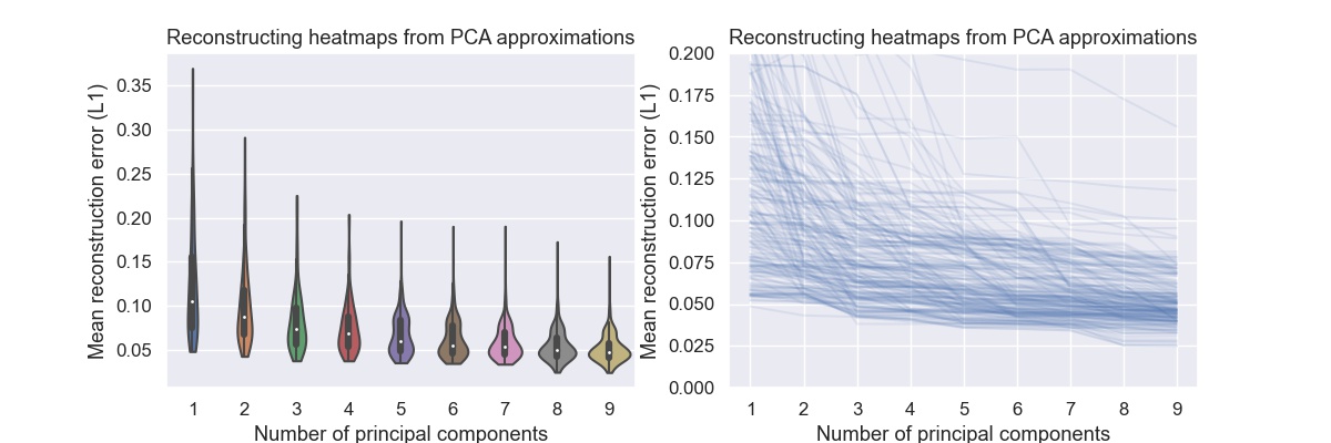
The same plot where the maximum error is replaced by the mean error shows that with four components the mean error is below 0.1 for most algorithms. One could argue that the except for outliers the space of regional FMR heatmaps can be expressed with four dimensions. Given that the heatmaps contain 100 numbers, this is quite a reduction.
Conclusions
What have we actually learned? In all fairness, probably not that much. We looked at FMR heatmaps, did some exploratory data analysis and looked at some trends. We have seen that there are a few common directions of variation and that these directions involve FRM trade-offs. Reducing FMR for one region is likely to increase FMR for other regions. We have also seen that certain regions are coupled as far the FMR is concerned.
We did not address the reasons for these observations, because we don’t know what these reasons are. All we can do is list some possibilities:
- Our sample of algorithms is biased. The space of possible face matching algorithms is vast and we are restricted to those algorithms that were submitted to NIST for evaluation.
- We don’t need all algorithms to be unbiased. If we can develop one accurate, bias-free algorithm that is enough. And so, studying the zoo of other algorithms might be academically interesting but also irrelevant.
- Data from different geographic regions might be biased in different ways. For example, image quality could be worse in certain regions leading to higher FMRs.
Maybe, just maybe, some of the observations made in this blog post tell us something about the nature and limits of face recognition algorithms, at least under the constraints on computational power and available training datasets we have today. Maybe the sample of algorithms is large and diverse enough, and maybe the evaluation dataset is controlled enough that some observation are valid. One can but hope…
Methods
I used python and Beautiful Soup to parse the FRVT 1:1 report cards from NIST’s github repository. After that analysis was done using jupyter, pandas and seaborn. All code can be found in this repository.
-
Bias manifests itself most strongly in different FMRs across population groups, while FNMR is much more equally distributed. An argument can be made that for 1:1 matching FMR differentials matter much less than FNMR differentials. While this post focuses on FMR, it is an important caveat to keep in mind. ↩